Flight add-ons
Almosafer.com
2025 - 2026
about
Almosafer is a leading online ticket agent in Saudi Arabia
My responsibility was mainly on conversion rate of flight funnel team where I designed the experience from search for flights to payment.
On flight funnel we also offered users with add-ons such as trip insurance, baggage protection, and many more.
The data and confidential information in this case study has been altered to comply with non-disclosure agreement. All information in this case study is my own and does not necessarily reflect the views of Almosafer Travel and Tourism co.

Role
Qualitative and quantitative research, UX design
Duration
6 months
Impact
Aimed to improve revenue by 1.7 times in 2026 by improving the attachment and eligibility
Add-ons, our second best source of revenue. But where’s the money?
Unlike selling flight ticket, we receive 100% revenue from add-ons selling.
We sell 7 add-ons but only 17.2% attachment rate from 90% eligibility and only one add-on supported the whole selling.
So, what’s the problem?

End-to-End designer means you own the research process too
I looked on the problem of attachment rate since the eligibility rate number are still good
I spent time to find out as many data I could from doing heuristic evaluation on current design, data analysis on Amplitude and the raw data provided by data analyst, and with the help of UX researcher I did desk research as well.
Together with the team I came up with multiple problems in hands which could help to improve the attachment rate.
The problems were:
01
Inconsistent design of add-ons on different pages and platforms.
Add-ons are presented in different layouts and design on different sections of the page causing inconsistencies.
02
Unclear pricing
Pricing that shown to the users are only consists of the currency, the amount and slashed price only without indicator of how many passengers the add-ons applied to
03
Insufficient information shown for each add-ons
Information provided were limited to the information regarding the benefits without further info about terms and conditions or how to claim the add-ons after purchase.
04
Add-ons offered lacking of relevance with the flights or users.
Some add-ons offered for users who doesnt need add-ons. On the other hand, some add-ons should be offered for certain segment of the users or flights.
05
Limited offer
Some add-ons offered are not up to user needs.
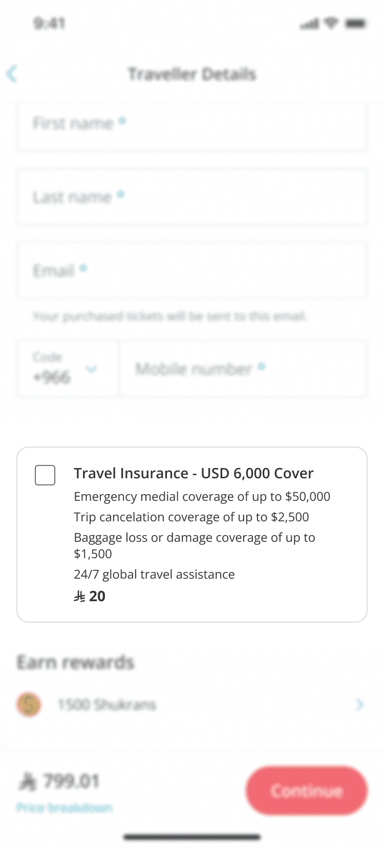
Passenger detail page

Add-ons page
Ideation; because the more the merrier
I conducted ideation with the team to generate ideas based on the problems above. We then narrowed down the ideas that within our scope. For example, adding more add-ons were, without question, is out of scope since its basically a completely new business decision.
There was also ideas that treated as recommendation such as improving after sales since the post booking experience was owned by another team.
In conclusion, we decided to go with three approaches:
01
Dynamic add-ons recommendation
Recommend add-ons based on the user segment, flight type, with contextual placement within the funnel
02
Improve information and UX
Clear pricing, complete information, and keep the consistencies between platforms and improve the visual, add CRO messafes
03
Increase sales
Improve add-ons flexibility and push more add-ons accordingly
Finally, time to do design
The design solutions were based on the 3 directions derived from connecting the problem and the ideas generated on ideation session.
Ensured each add-on is visible / recommended to the most relevant customer segments
To maximize personalized value, reduce purchase friction, and increase the segmented attachment rate without negatively affecting overall add-on revenue.
Improved the clarity, visual positioning, and information architecture
To increase user understanding of key benefits and lead to a increase in purchase intent and conversion rate.
More information
Additional info can be found by clicking the link
“Add” CTA
based on previous experiment, using CTA button increased attachment rate compared to checkbox

1-2 lines description
To give context about the add-ons

Clear pricing
price shown per traveller to mimic the pricing shown in the funnel

Enhanced visuals
Icons and subtle background color to distinguish add-ons with other section on the app
Offered greater flexibility
To increase their perceived value and purchase intent, resulting in an overall increase in the add-on attachment rate
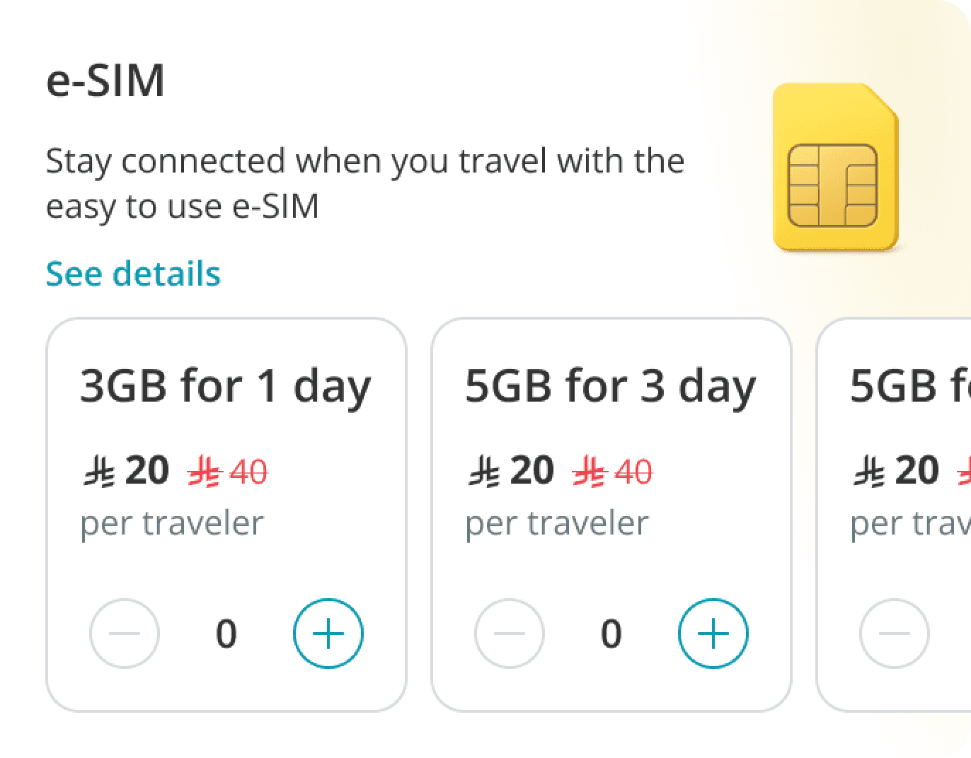
Tiering of one add-on
To give more options for users. For example multiple gigabyte options for e-SIM
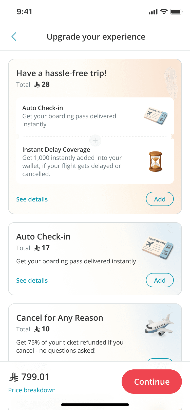
Add bundling of multiple add-ons
Multiple add-ons bundled together with cheaper price than a la carte. Add-ons bundled were decided by product and add-ons team

Pushed add-ons to more segments of users
To increase their perceived value and purchase intent, resulting in an overall increase in the add-on attachment rate
Cancel for All Reasons for non-cancelled flight
Can cover 68% of the users
Baggage Protection for flight with stopover
covers 20% of the flight bookings
Baggage Protection for flyers with extra baggage
covers 2% of the flight bookings





Things went so smoothly, almost too smooth...
I was working hard on improving the attachment rate when the change of direction due to the request from upper management happened. The direction was changed to increasing revenue. meaning the scope getting broader and out of design scope. This changes also surfaced different priorities and changed anything we had worked on.
Moreover, measuring the revenue is out of design scope. Therefore we got help from product team and add-on team.
So, what changed? from design perspective, nothing...
In order to increase revenue, attachment should be improved and some changed needed to be adjusted on the business model.
Therefore, after compared the findings from both team we figured out that the research I did couldn’t completely discarded. Rather, my original direction became the design foundation for the expanded scope.
Since two approaches converged almost entirely with success metrics focusing more on the revenue, the product team's revenue-led priorities mapped directly onto the segmentation and relevance work I'd already designed.
This suggested that the design direction wasn't just defensible on UX grounds, but also held up under business scrutiny
In the end, the design got handed over
Due to some factors, the final design handed over to other designer. I handed over the concept design, the prototype and research plan. The research i made with the goal of:
To understand users perception of the add-ons and what motivates them to purchase
To validate the clarity on the design
Information architecture
Pricing
To examine the contextual positioning
To understand the optimal placement for selling different add-ons while minimizing the risk of overwhelming them with frequent offers.
To validate the concept of tiering for Insurance products
After the iteration did based on research result, development was planned to be done throughout 3rd quarter of 2026 in several phases.
Unfortunately, by the time the impact data are gathered, I’ve already out of the company.
Changes sometimes inevitable, but can be anticipated
While working on this project, I was struggling in gathering the data especially because I didn’t have access to the raw data and the data scientist resigned when we just started the project. Then, after spent time just to figure out the data, we faced the change of the project direction.
Fortunately, by the time it happened I already gathered some data regarding the eligibility as well so we dont have to restart our work. Our ideation was broad enough too to so we had enough ideas to cover the problems.
You have reached the footer
@ 2026 Sri Bouty. This website is best viewed on desktop.

Previous
Next